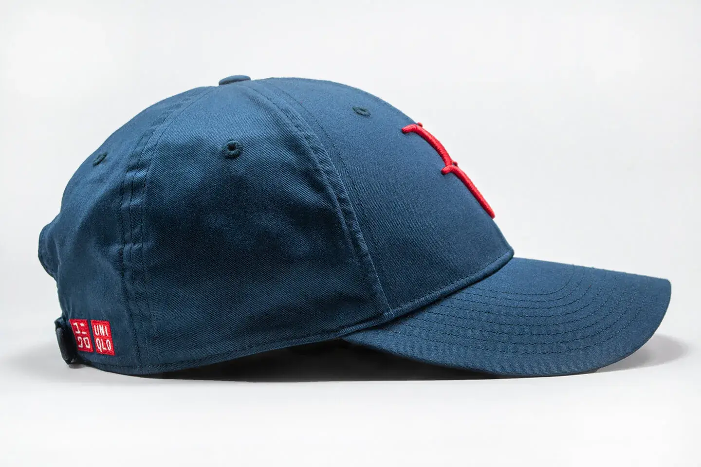
I had the opportunity to work at the Toronto Zoo as a Graphics Assistant. My work consisted of using the Adobe Creative Suite, mainly adobe Photoshop, Illustrator, and InDesign to provide in-house graphic production work. Therefore, I was tasked with creating a variety of posters, and signage for wayfinding, safety, and animal enclosures. These tasks included using the Adobe Creative Suite to create new designs for signs, recreate old, faded, or damaged signs, make modifications to mockups such as implementing edits, and using previously created templates, graphics, and design elements to create new signage.
This was a team project to create promotional material for the Year of the Tiger at the Toronto Zoo. Other members of the team were tasked with creating the main tiger Illustrations, and my task was to create the layout using those assets.An example of using a provided template to create these animal exhibit signs. I was tasked with inputting the necessary information, and finding a suitable photo.
Following the established style and theme of the animal enclosure signs, I was tasked with providing new designs and layouts for these animals. The process involved to create these signs included many steps: first, I had to measure the cases that held the signs to ensure the sizing would be correct. Secondly, I had to reach out to the zookeepers and the Learning and Engagement department to validate the information about the animals, as well as provide me with any new, updated information and names. Once the information was collected the next step involved acquiring the assets needed, mainly the photographs of the animals. After that, I would then create the layouts which would be sent for approval. After receiving approval, the new designs would be sent off to print.
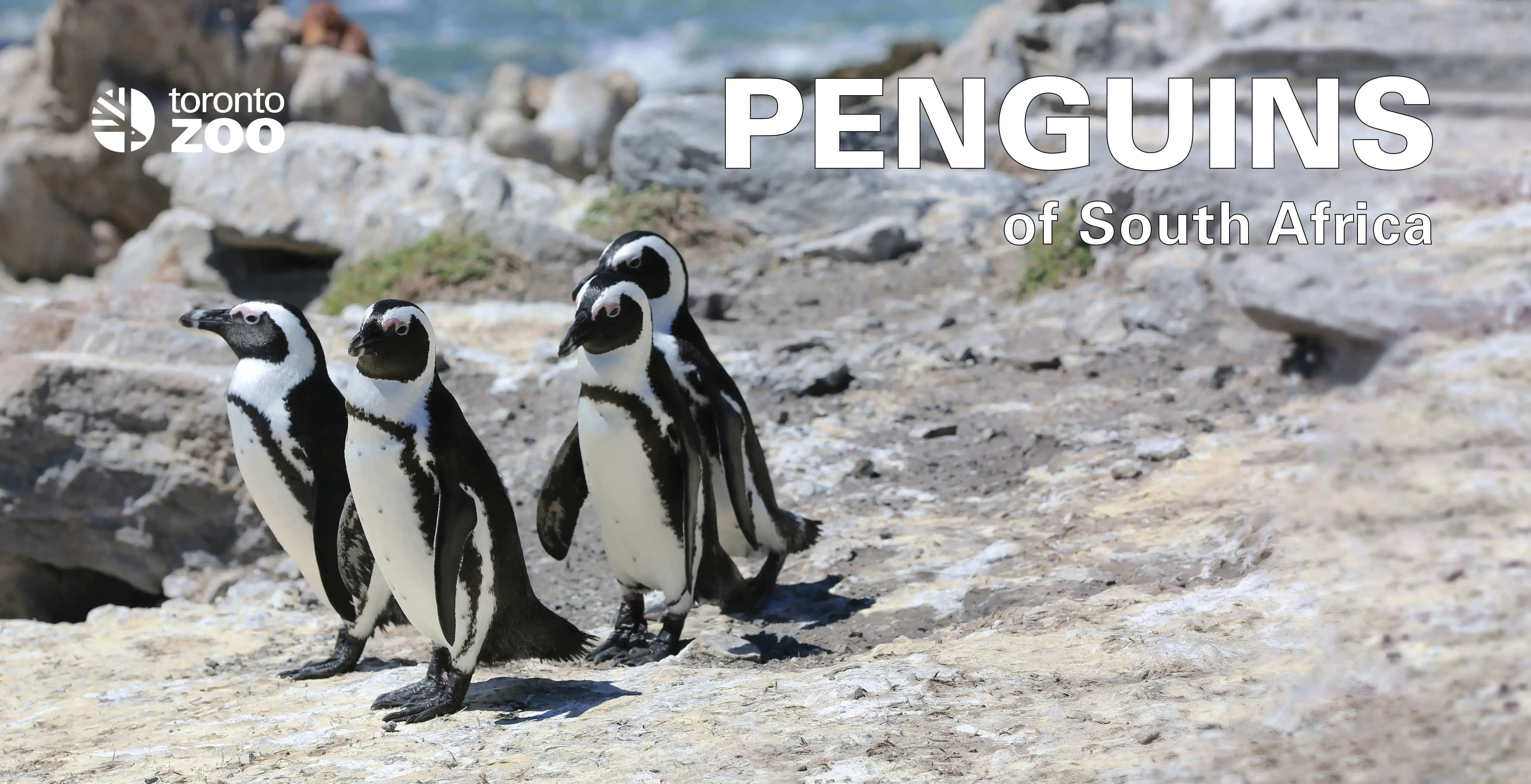
The new main sign for the penguin enclosure that I was tasked with designing.
As mentioned, one of my main duties was to ensure that signs around Toronto zoo property were in good condition, legible, or updated with new information. This was involved frequent inspection of the Zoo site to locate any old or damaged signs that needed to be replaced. Once discovered, I would then use Adobe Illustrator to recreate the sign, often having to also recreate the assets used in the previous sign as well. Once completed, they would be inspected for approval and then sent to print for them to be installed on Zoo property.
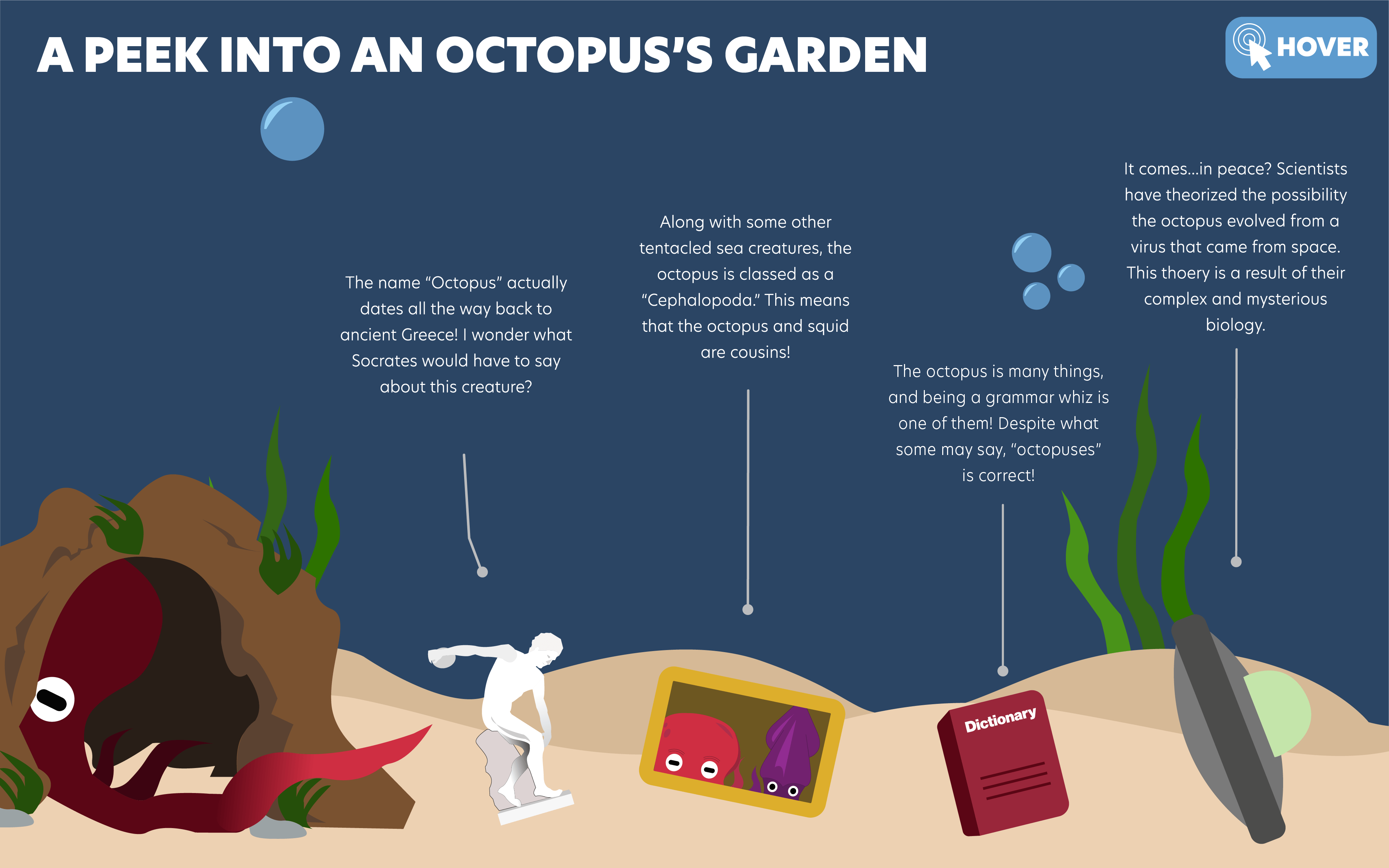
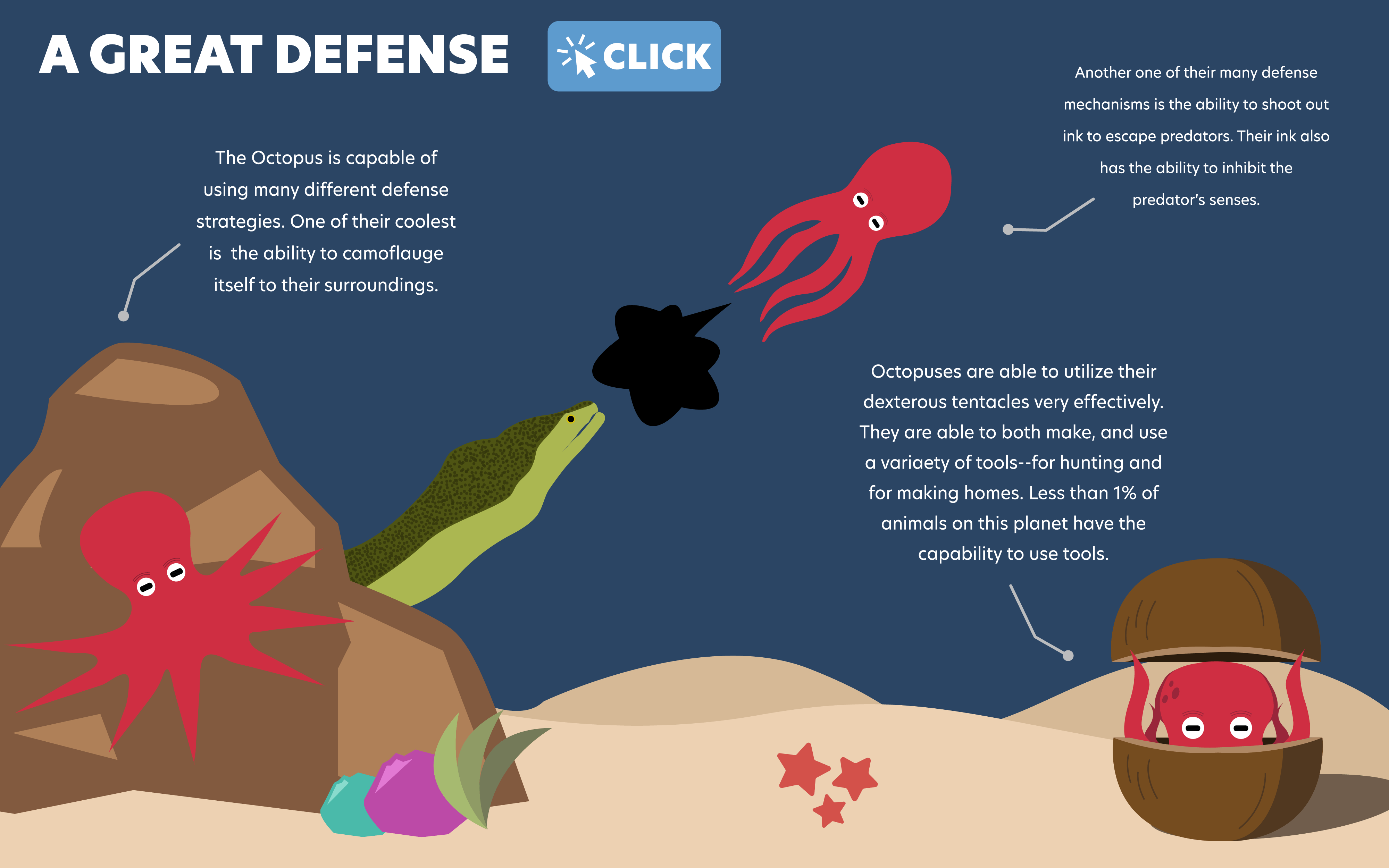
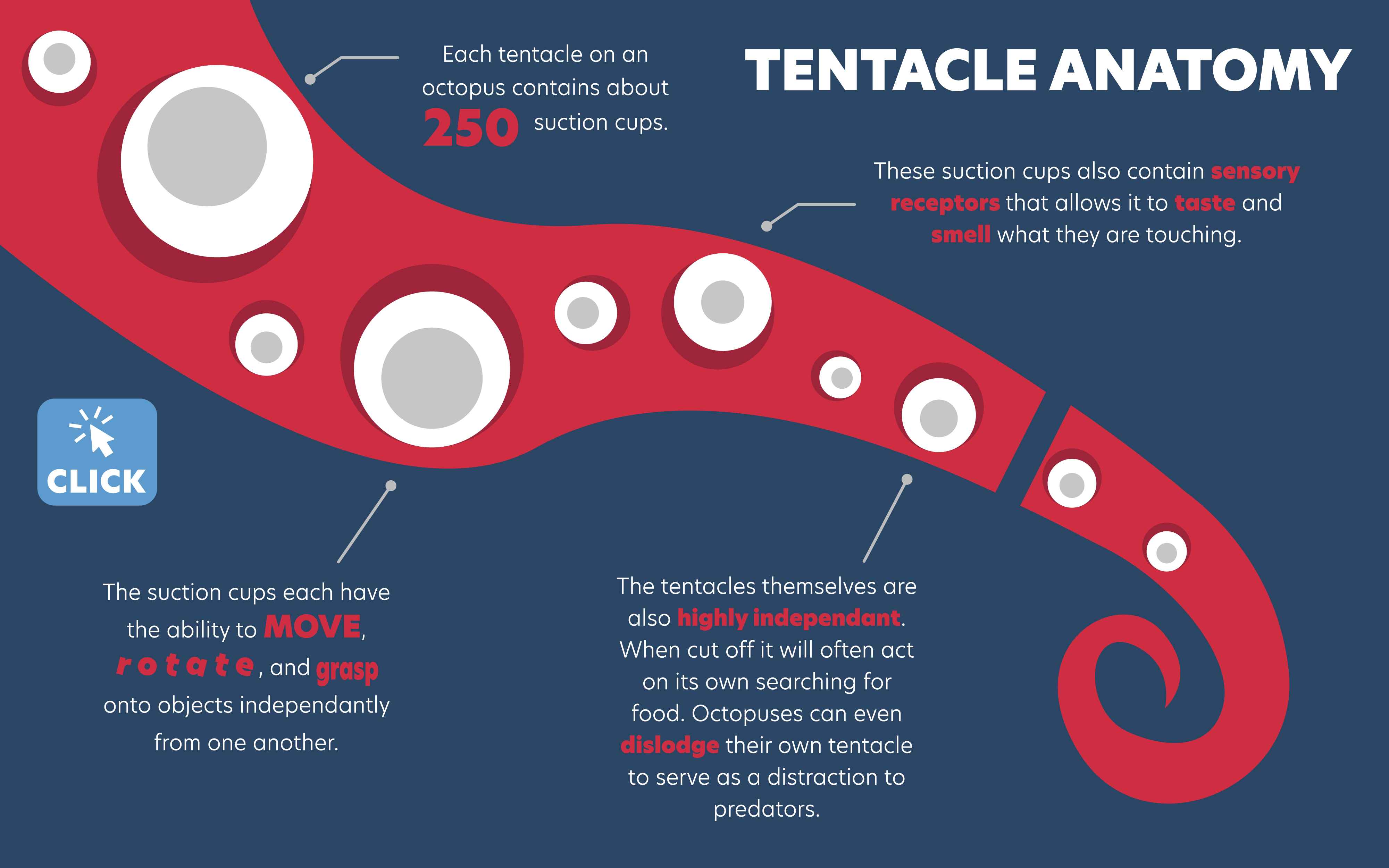
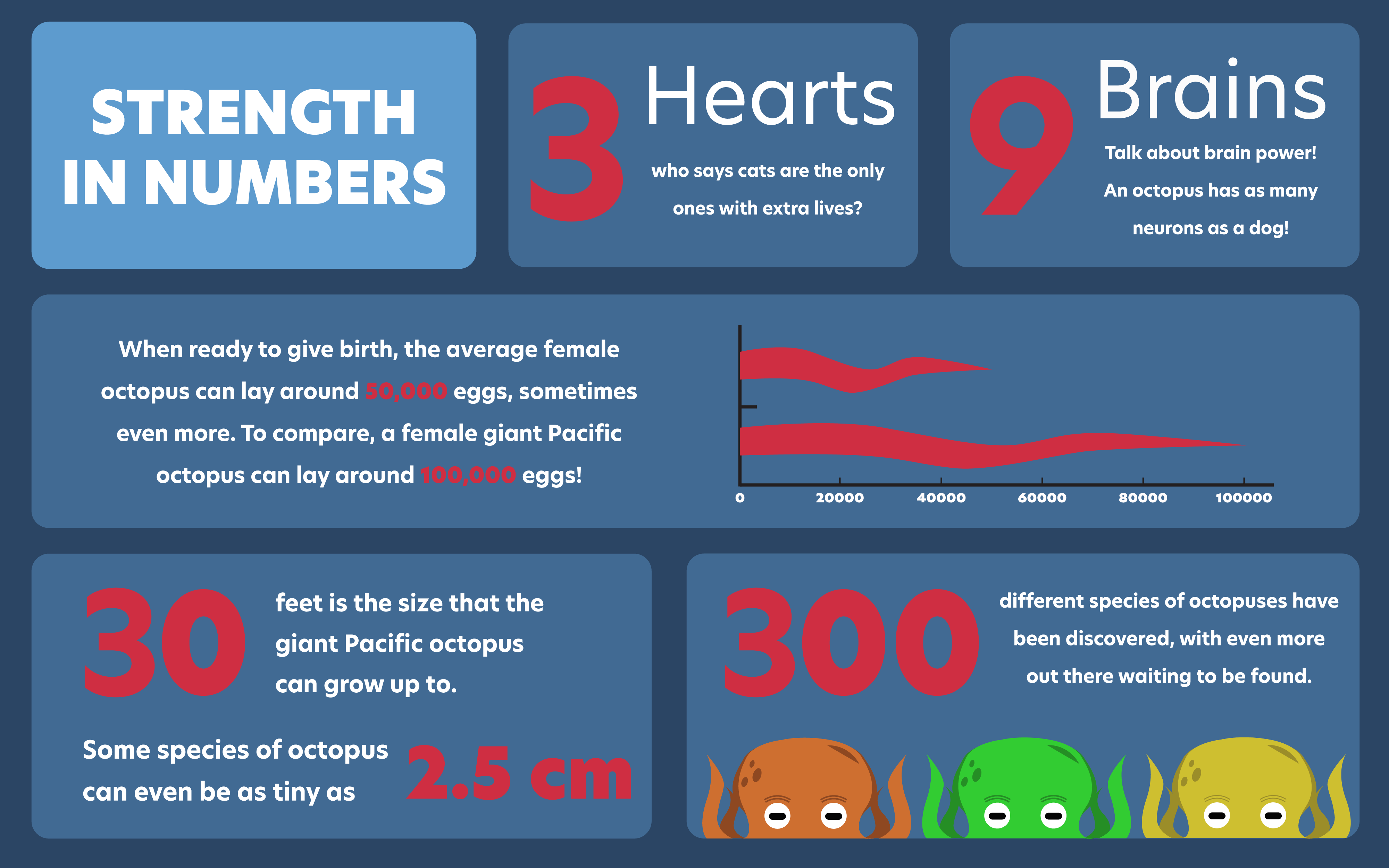
The purpose and main task of this project was to create an interactive infographic about any chosen topic. The octopus is my favourite eight-appendage creature of the sea, and therefore I dedicated this project to showcasing how magnificent this creature is. I began by conducting the research that will serve as the informational content of the infograph.
After the research was collected, I moved on to the design process. All the planning, assets, and illustrations were created in Adobe Illustrator. My main goal was to emphasize the spectacular nature of this creature, which resulted in the dark blue background and the strikingly-red coloured octopus. This is also influenced the focus on creating a characterization of the red octopus and showing it in different environments, as opposed to illustrating several different species of octopuses. Once the assets were completed in Illustrator, some were exported to Adobe Photoshop to create some of the GIF animations.
Once the design process was complete, all the assets were exported to Visual Studio Code to build the infographic. This process involved using HTML and CSS to provide the structure such as creating the slides that would contain each section, and then using CSS to style page and place the assets according the conceived design. Once that was completed, I used JavaScript, and mainly GSAP to animate all the elements and add all the interactions that brought this project to life.
The loading animation that plays before the inforgraphic begins.Animation of the octopus opening and closing its shell.
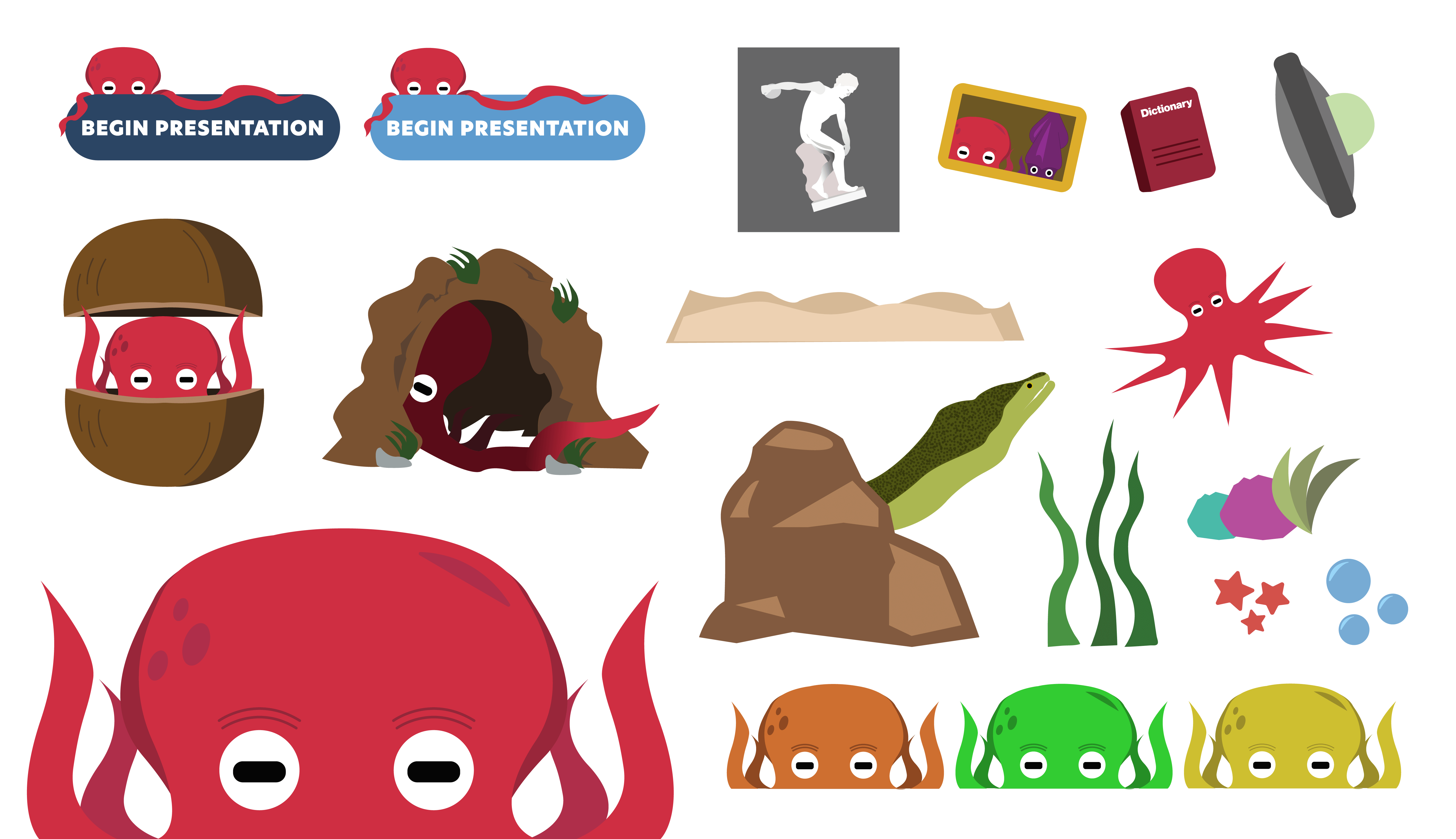
A collection of assets that were created for the project--all of which were designed within Adobe Illustrator.
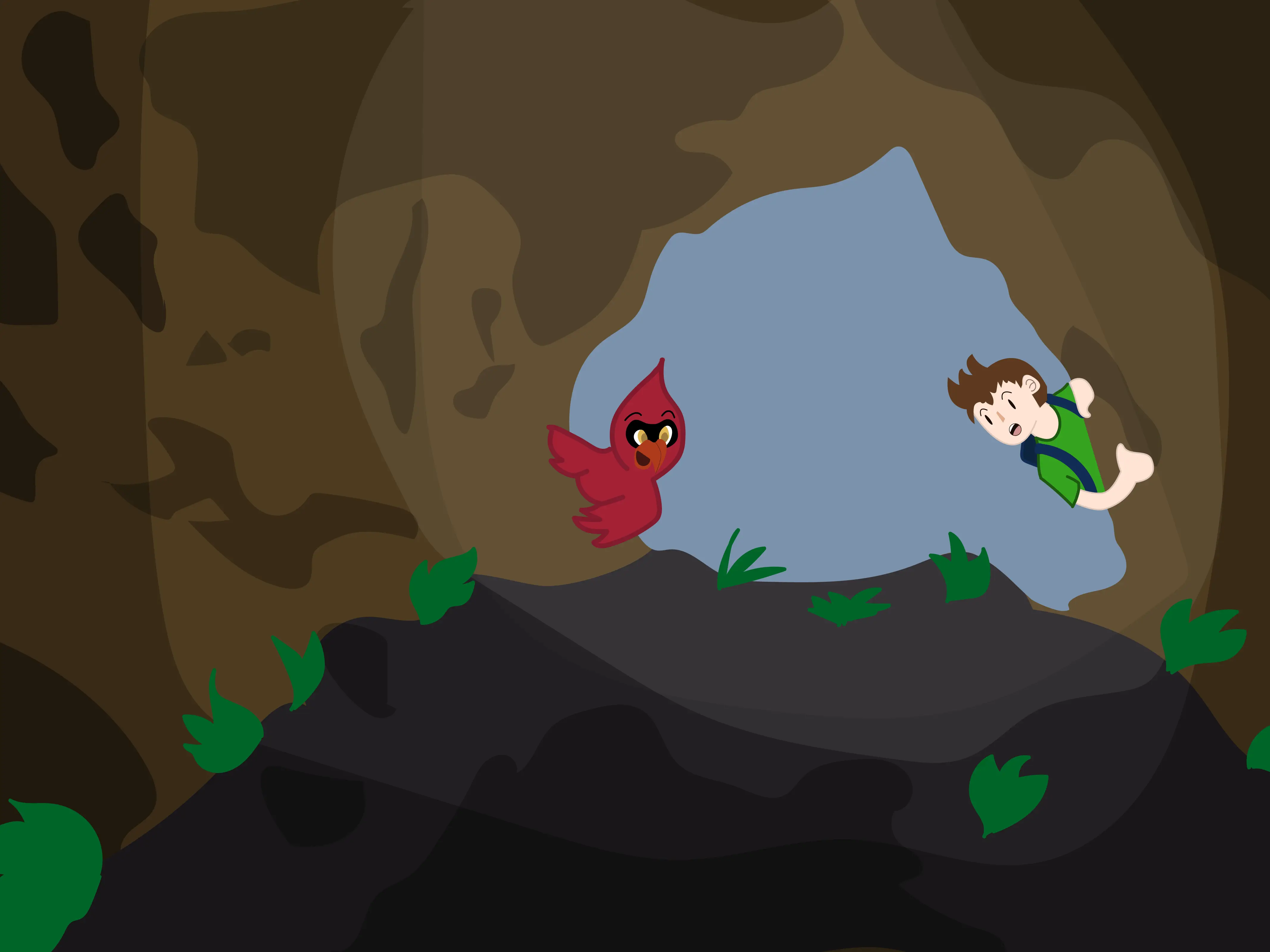
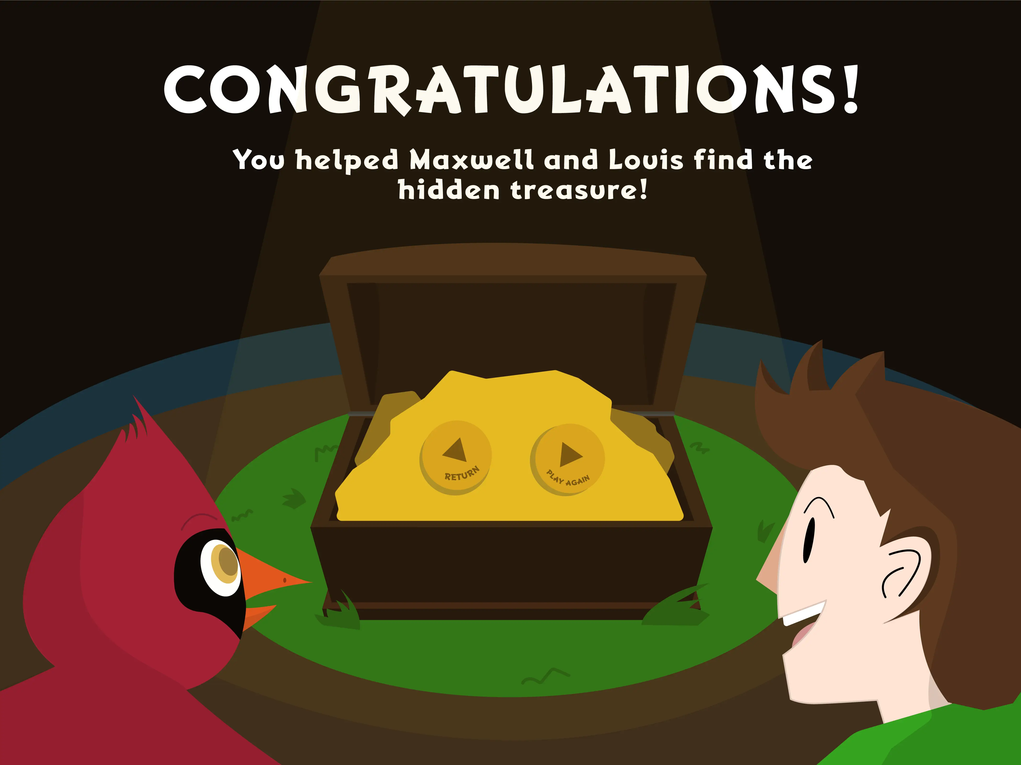
The main task for this project was to create and implement a design for this word game created throughout the semester. For the overall design and theme, I was inspired by the many cartoon shows, books, movies, and games that I used to watch, read, and play as a child growing up. Plenty of of the media I would consume as a child had a multiple characters that you would follow on an adventure, normally a human-like character as well as some personification of an animal as a companion. As a result of this inspiration, I created the titular characters--Maxwell, a boy, and Louis, his cardinal companion. I also wanted to evoke that sense of adventure that myself, and many others had when we were children. Therefore I decided to center the game around helping Maxwell and Louis find hidden treasure.
On startup, the user will be presented with two categories to choose from. After choosing the category, the user will then have to guess 5 out the 20 words that can appear in each category to help Maxwell and Louis find the treasure. Each word guessed will greet the user will an encouraging message from Maxwell to continue on! Upon successfully guessing the 5 words, the user will be greeted with the reward screen. The user will then be presented with the option to return to the main screen to play the same category or to experience the other category.
Game Card outlining the details of the game.Rough Sketches of the characters featured in the game.Assets for the game created in Adobe Illustrator from the pencil sketches.
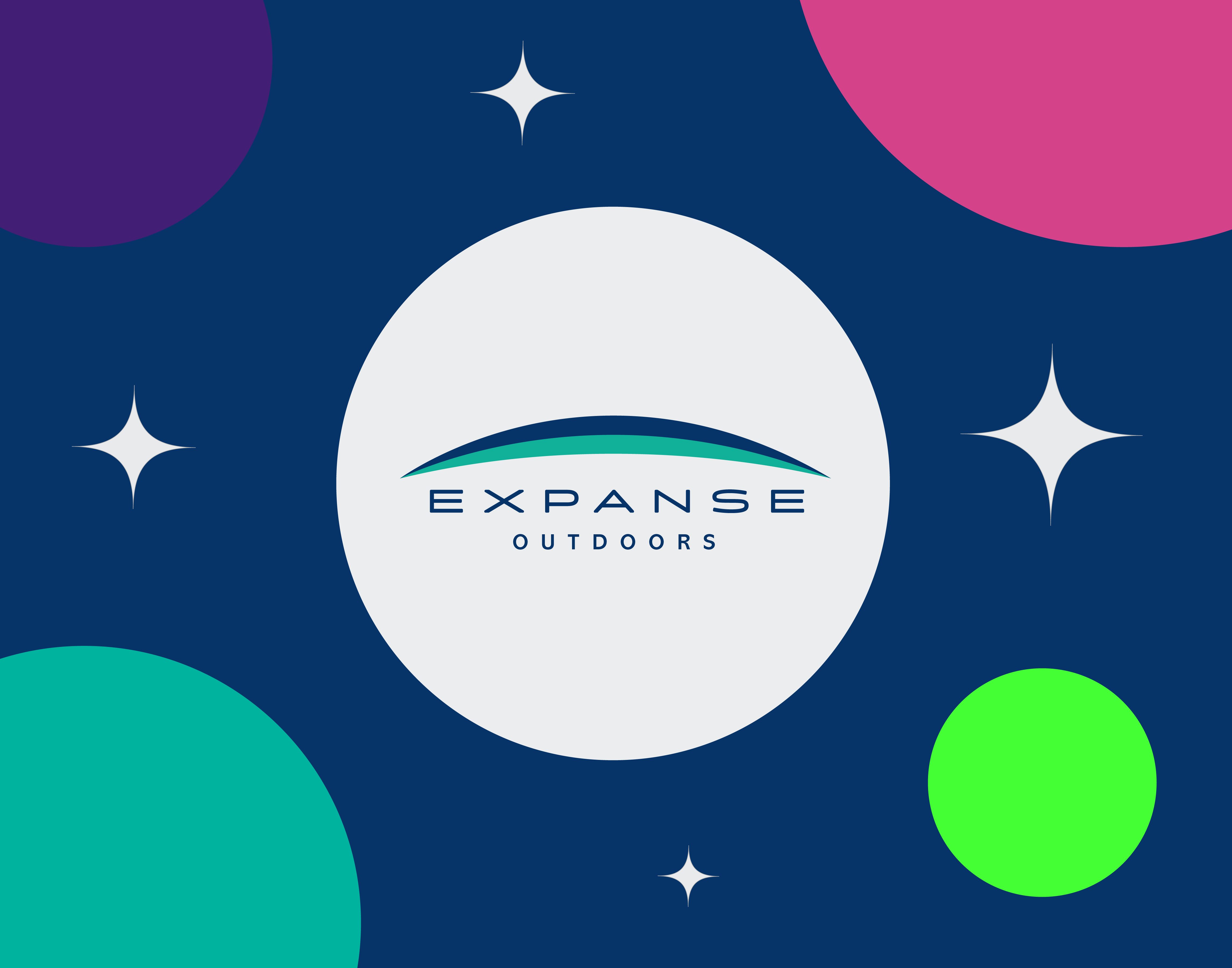
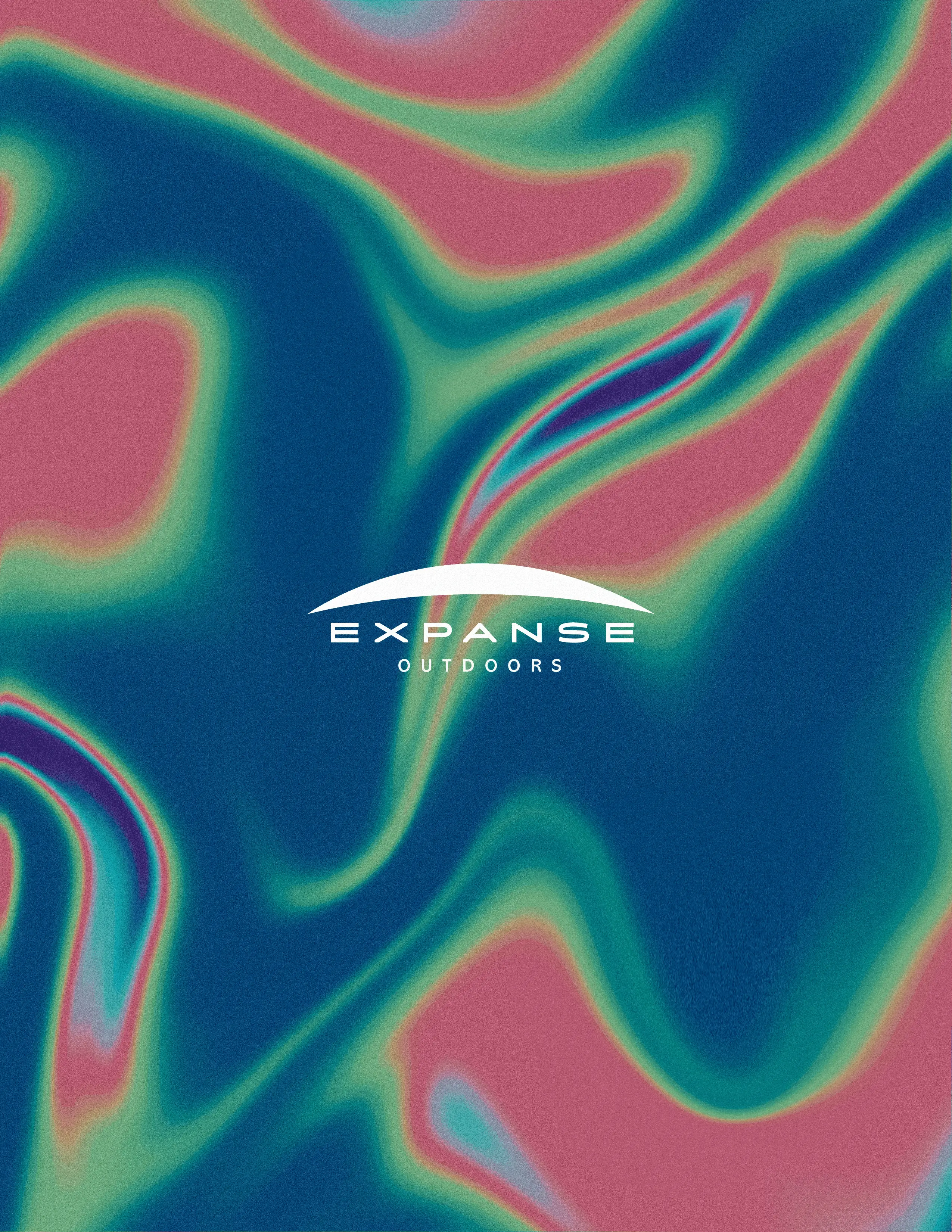
The primary objective of this project was to devise and conceptualize an outdoor brand, and to integrate the brand across a range of platforms, including social media videos, apparel, and an interactive retail installation. This page presents the development of EXPANSE Outdoors, involved the creation of a brand book, iconography for apparel and other EXPANSE equipment, T-shirt designs, social media videos, and an interactive retail installation.
The aim of the retail installation was to deliver a unique and captivating experience to potential customers, enabling them to engage with the brand and its products. This was to be achieved through three distinct stations, namely the Interactive Catalogue station, the 360º Rotating Product station, and the Touchscreen Ordering Station. To enhance this experience, each station was accompanied by a screen saver motion graphic video, in addition to three promotional videos created using motion graphics.
We were tasked with implementing our designs, photography, and layout into an already established code wireframe provided to us, to develop a cohesive experience for the Interactive Retail Installation. This involved using HTML, CSS, and JavaScript to position elements in line with our designs, including the addition of animations and transitions to create a seamless experience.
Apparel
Iconography for EXPANSE apparel and gear.
Interactive Retail Installation
Visualization of how the Interactive Retail Installation may appear in an EXPANSE outlet.
Interactive Catalogue
This is the Interactive Catalogue station. This station will allow the user to browse through three screens that will display a variety of catalogue items of EXPANSE Outdoors. Upon approaching the station, the user will be met with three physical items on a platform that represent the three collection screens. The initial screen of each installation with have a motion graphic video with instructions on how to operate the station. For example, one physical item could be a water bottle, and when picked up off the sensor it will trigger a screen transition to the collection associated with that item. When on that collection screen, the user can press the physical button located near each item that will give a detailed look into the highlighted item. When finished with the collection screen, the user can place the item back over the sensor.
360º Rotating Product Station
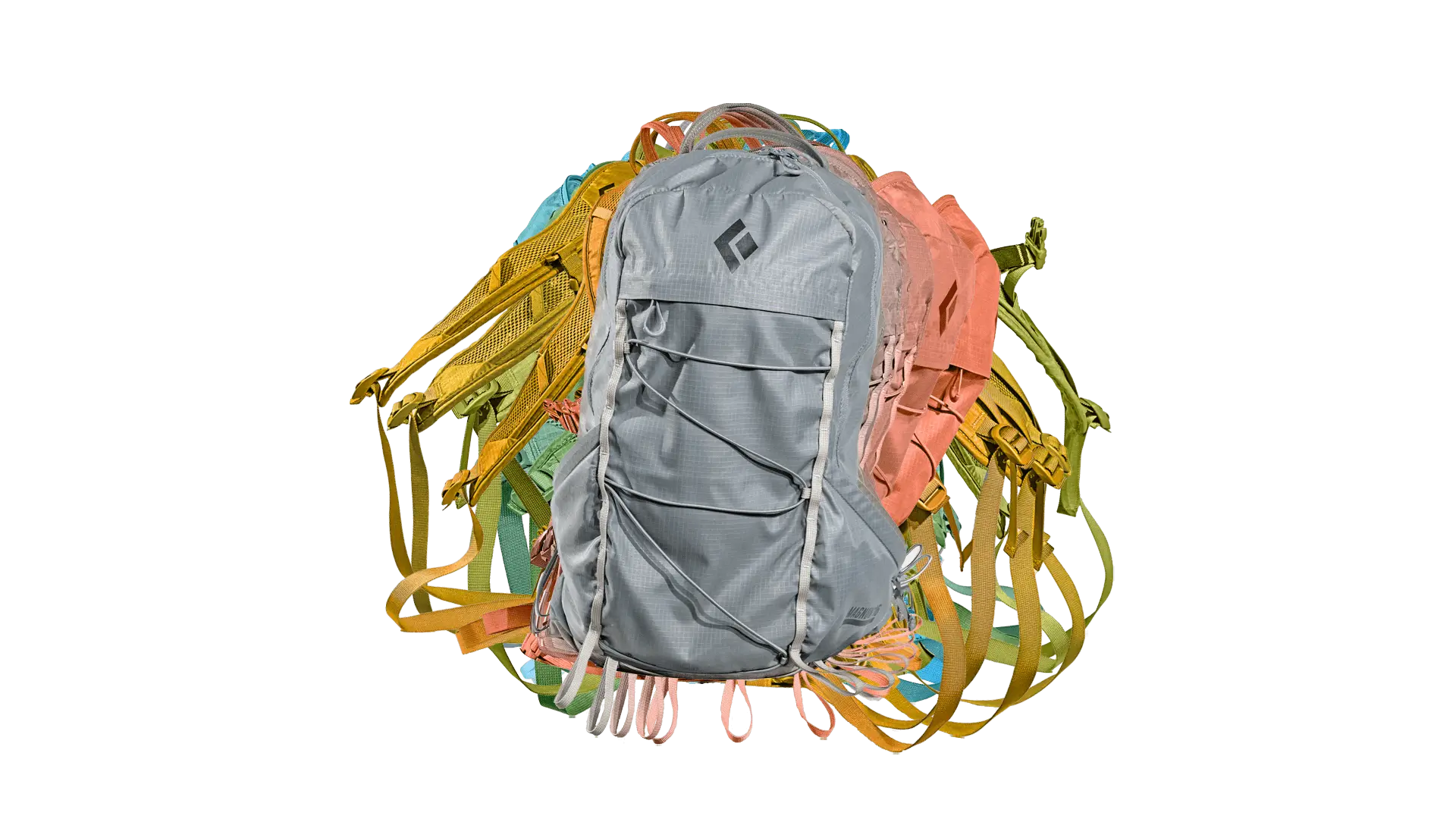
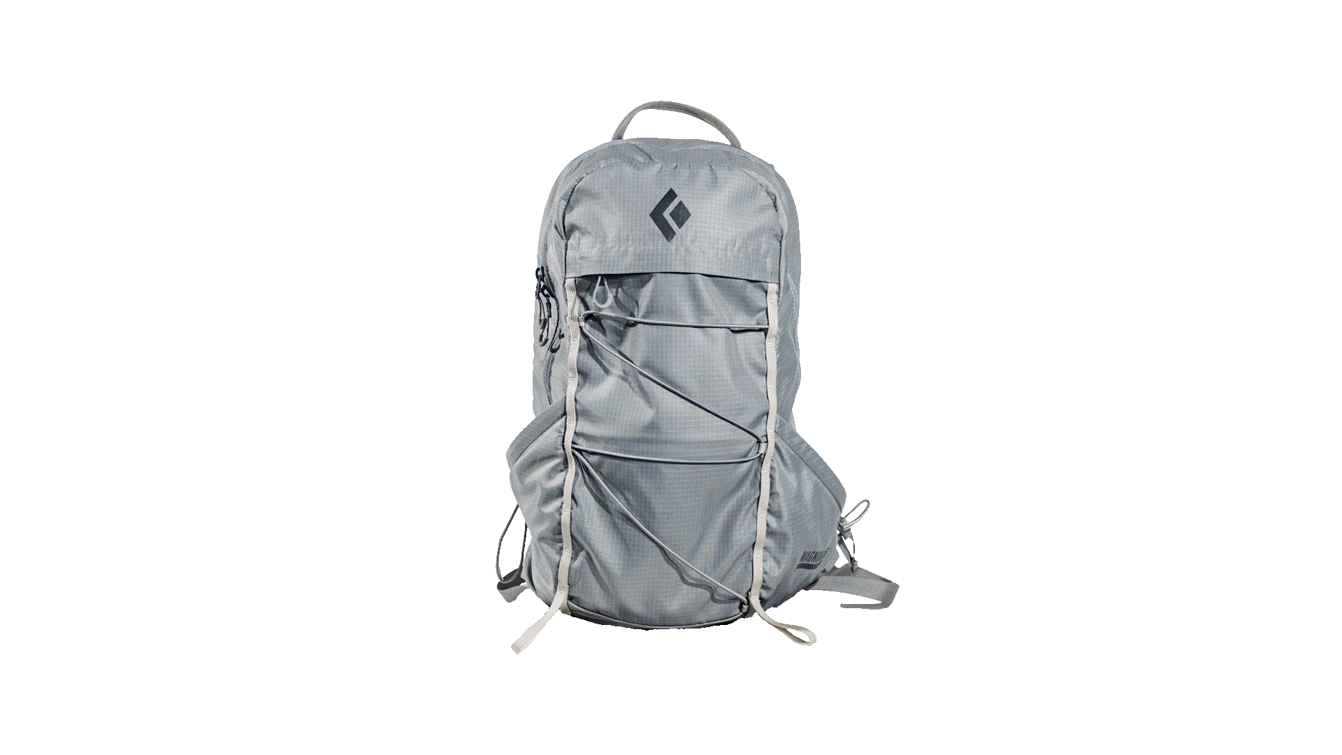
This is the “Rotating Product Station”. This will focus on creating a more immersive experience compared to the previous station. There will be a sensor which will allow the user to see virtual representation of their hand, and then with a swiping motion rotate the backpack to view it from 4 main angles. The 360º effect was achieved by photographing the backpack at 24 different angles to create an image sequence. The photos then had their backgrounds removed in Photoshop and saved as 24 different images. The JavaScript code uses these images to create the 360º effect when the user swipes on the image at the station.
Similar to the previous section, the screen will have a motion graphic video that will display the title of the section as well as instruction on how to operate it. Successful operation of the station will begin to rotate the bag depending on the direction input from the user, and will build on the information associated
with that screen.
All the images in sequence used to create that "360º" effect.
Touch Screen Ordering Station
This is the “Touchscreen Ordering Station”. This station allows the user to view three different outfits for men and women, from the front and back, and mix and match the various clothing on the model. The user will be able to navigate these options through buttons labelled with the corresponding action, as well as swipe on the models themselves. This was achieved by photographing two models in three different outfits each, both from the front and the back. Next, the photos were brought into Photoshop to be cut into 4 sections: headgear, upper body, legs, and feet. As a result, this allows the user to mix and match the different clothing
items at this station.
Once again, upon approaching this station there will be a motion graphic video detailing the station and giving instructions on how to navigate the interface. The user will be able to swipe through the clothing items, which all have descriptions that will update as the user swipes. Once they have an outfit that they like, they can hit the "order outfit" button which will direct them to a checkout screen that will print a receipt upon order confirmation, and give instructions on how to confirm the purchase.
The core objective of this project was to create and implement digital signage for the TV screens located throughout Durham College Campus. The project unfolded progressively over the course of the semester, with each week devoted to advancing its development. The digital sign encompasses six distinct segments, namely, the logo pane, the weather pane, the motion graphics section, the YouTube display, the news column, and the ticker tape.
The desired outcome of developing this project was to create a digital sign that is similar to ones found on news channels, such as CP24. Therefore part of the process was to create a design that is meant to transmit useful information but in a manner that short and concise. In other words, a individual should be able to take brief looks at the sign and still be able to draw useful information from it. Therefore, one of the main design decisions behind this project was using the Durham College brand colours to create areas that would separate each section.
This project also allowed us to work on both the backend of the digital signage to create the slots for the information that would populate the sign. This allows to add, delete, and edit any of the information found on the sign. The first five weeks of the semester were dedicated to creating the backend which involved working with a wireframe and developing week-by-week through HTML, CSS, JavaScript and php. Once the backend was complete, the next step was implementing our designs into the front end.
Early design of this project.
As stated earlier, the digital signage comprises six components, each requiring separate planning and design. For example, we had to create 18 distinct weather icons for the weather panel, which the sign will rotate through and exhibit based on the day.
The weather icons designed for the digital signage.
Apart from designing weather icons, we were assigned the task of producing three distinct motion graphics videos: a public service announcement (PSA) for Durham College, and videos for two businesses, Subway and Metro, which were my preferred choices. This undertaking involved collecting relevant information about each brand and gathering the necessary resources for creating the motion graphics in Adobe After Effects. In the case of Subway, my main objective was to develop a motion graphic that would endorse a new hypothetical sandwich at the restaurant. With Metro, my goal was to showcase the store's abundance of quality goods by highlighting three of their main areas found in the store.
Subway motion graphicMetro motion graphicDurham College motion graphic
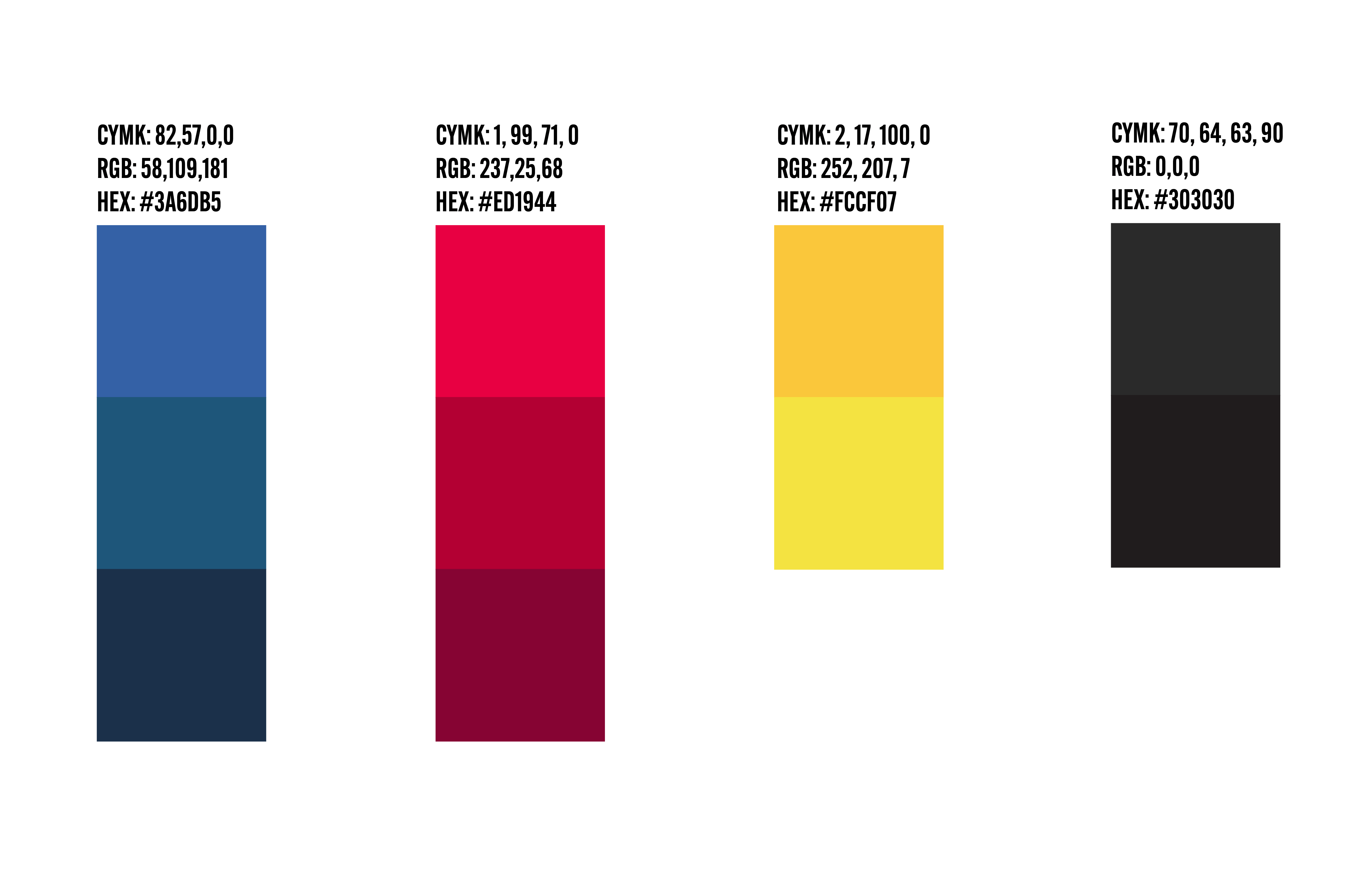
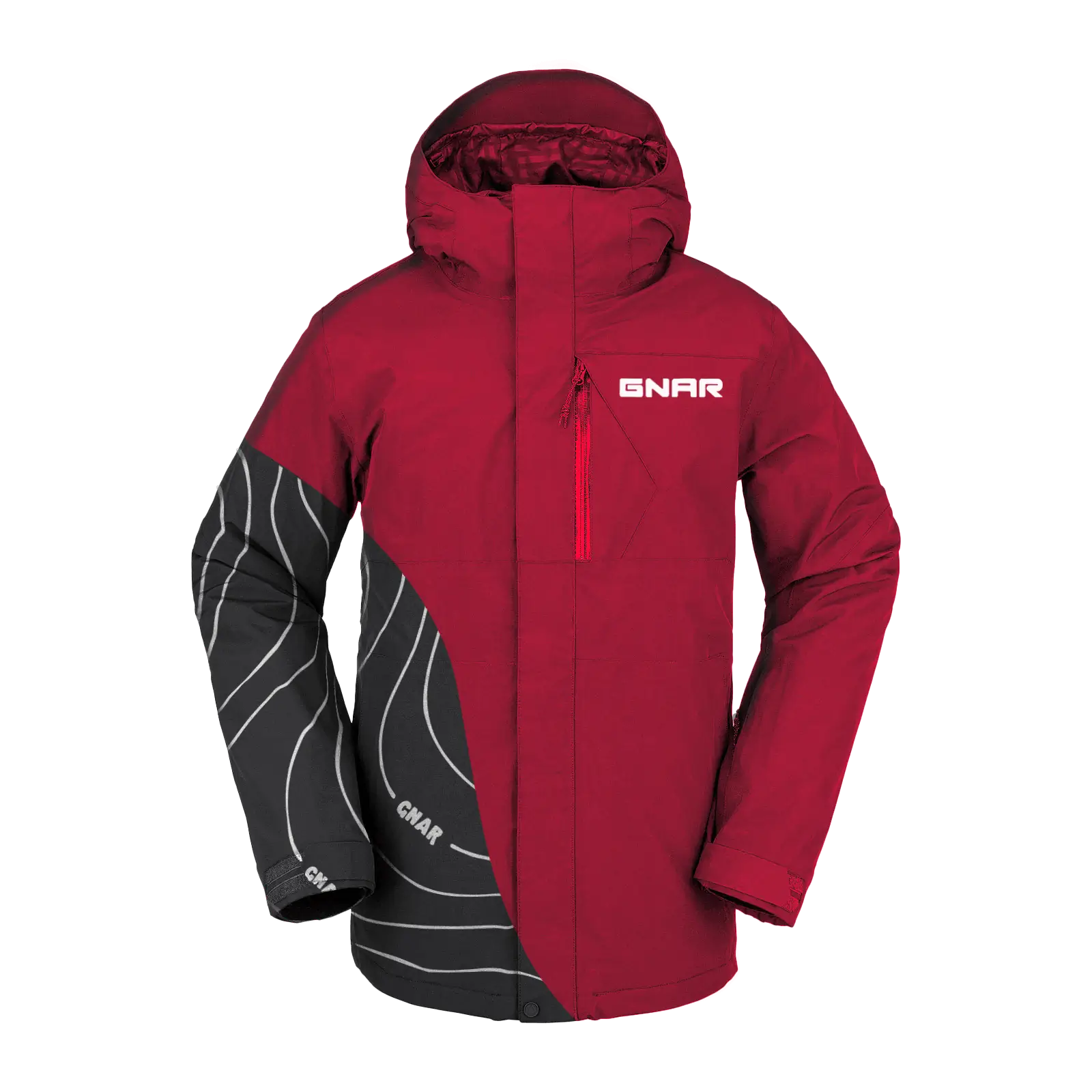
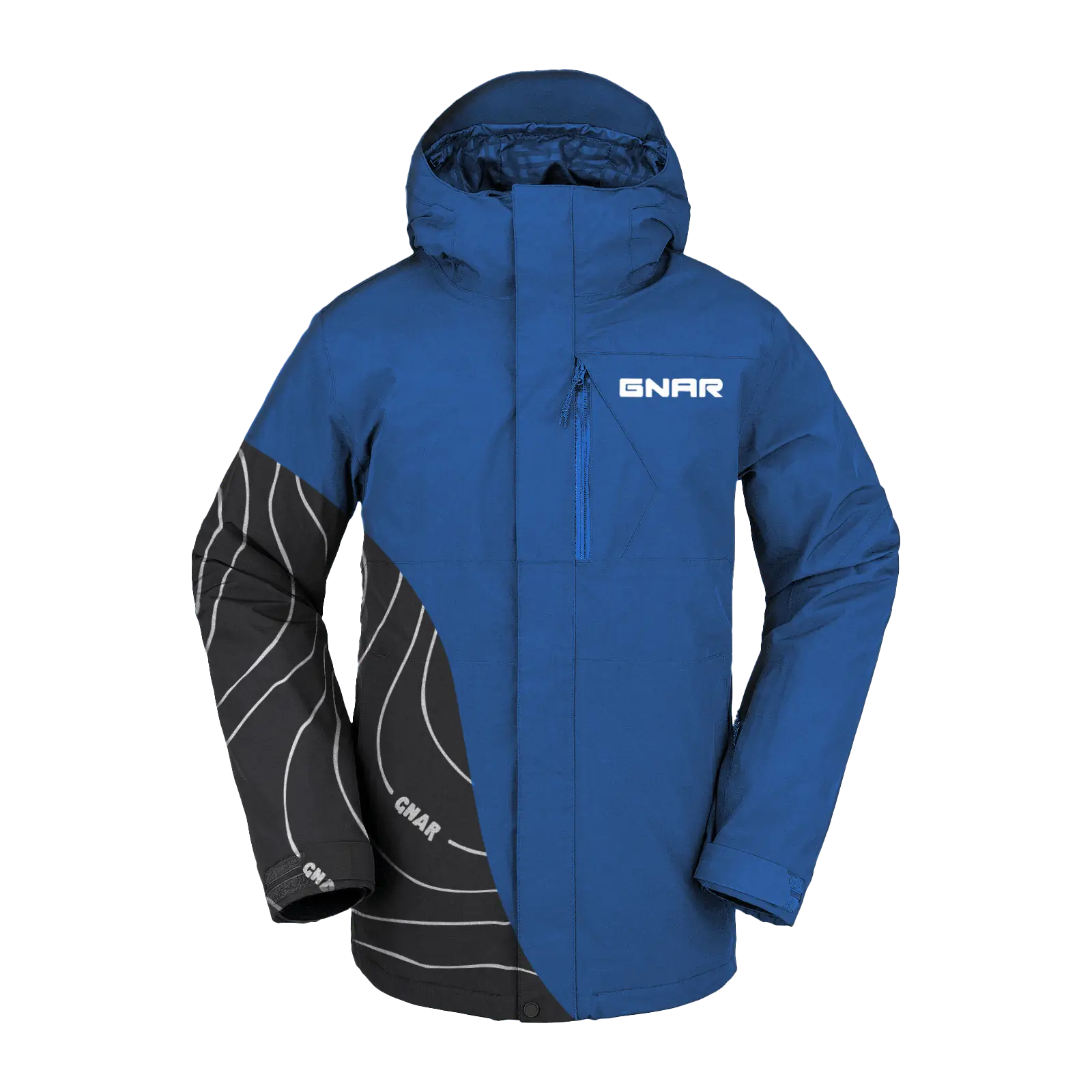
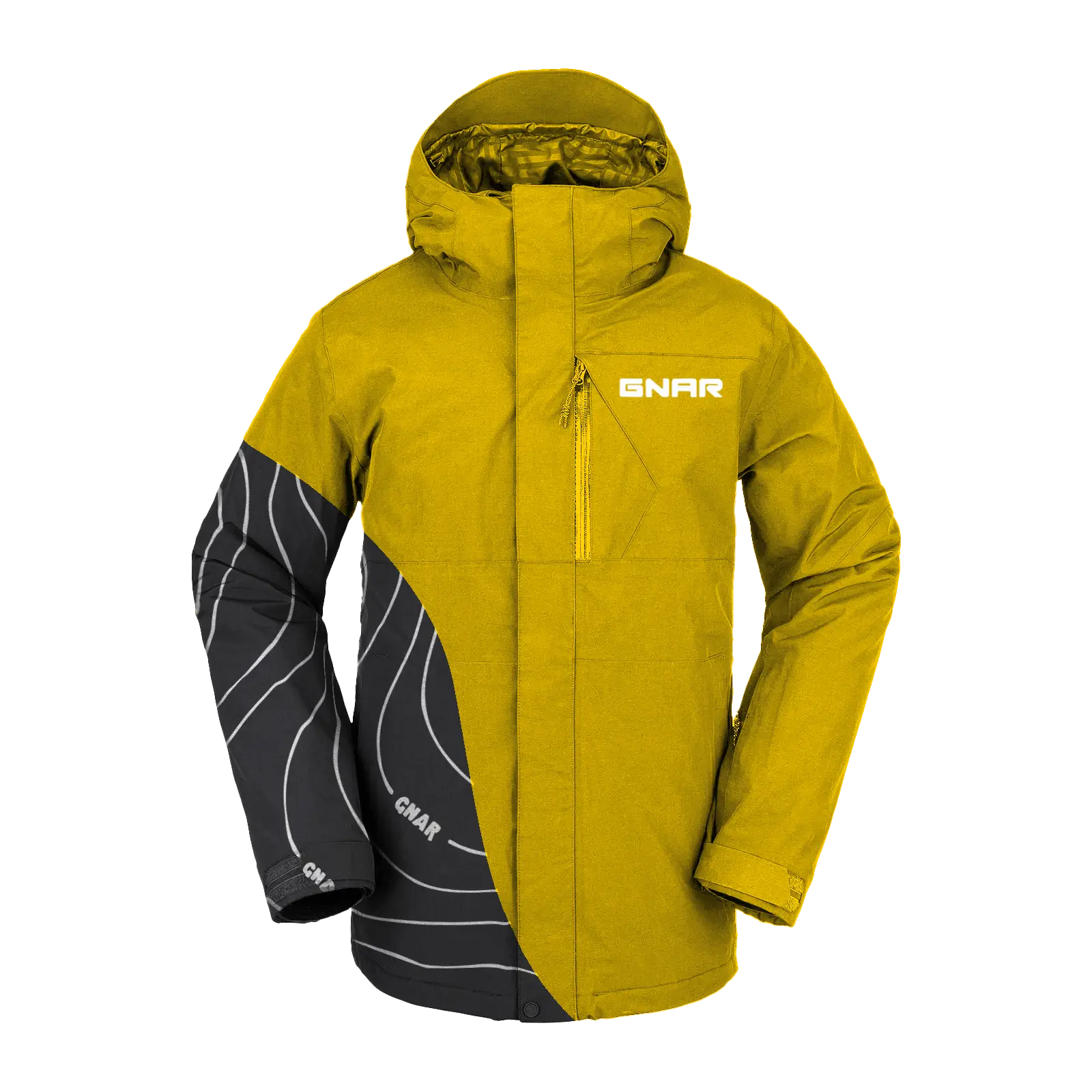
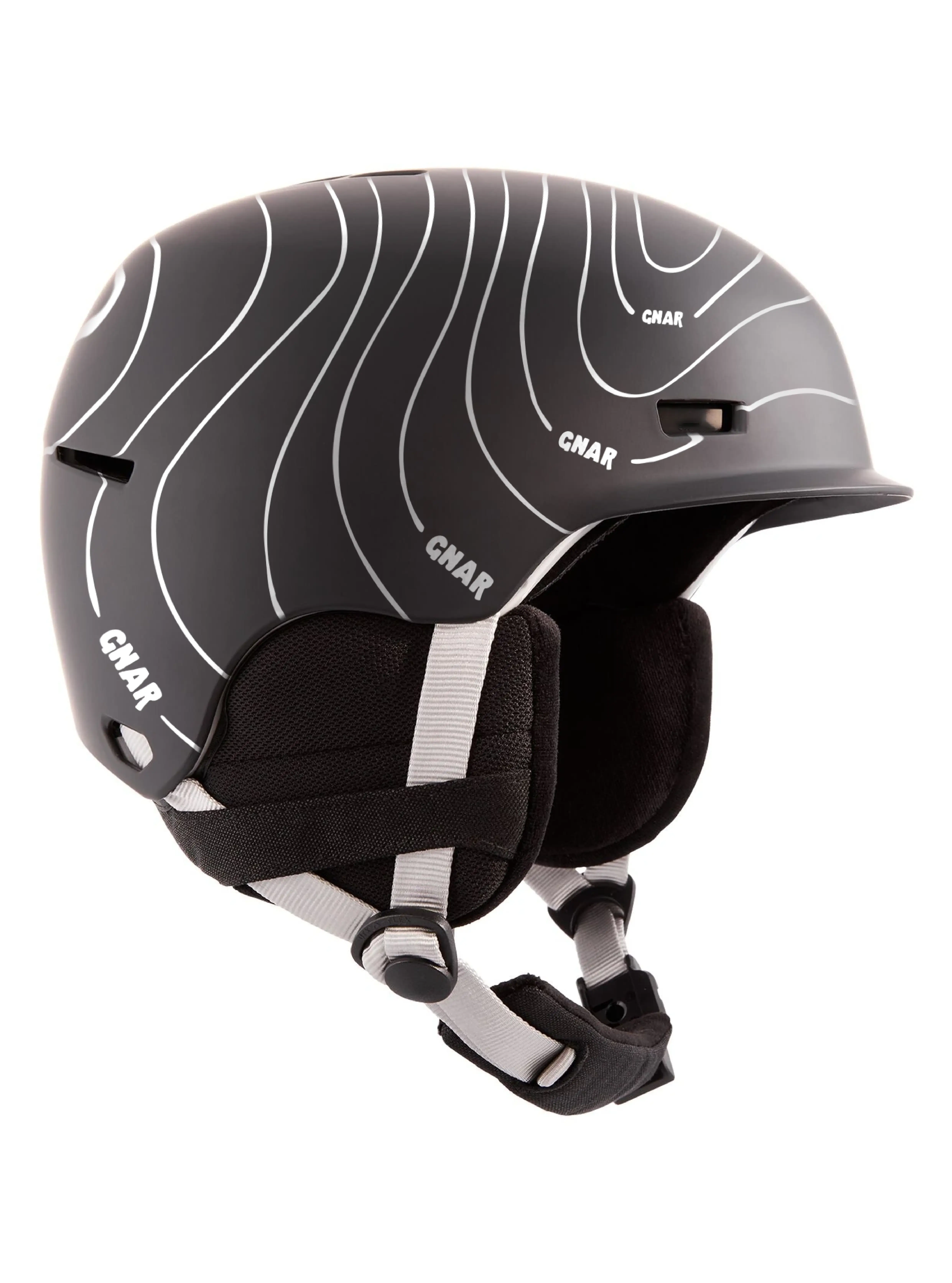
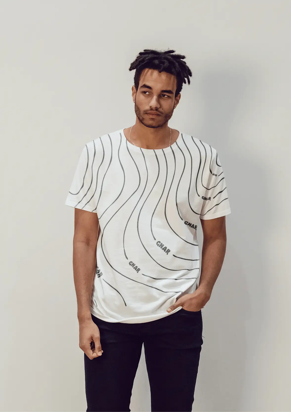
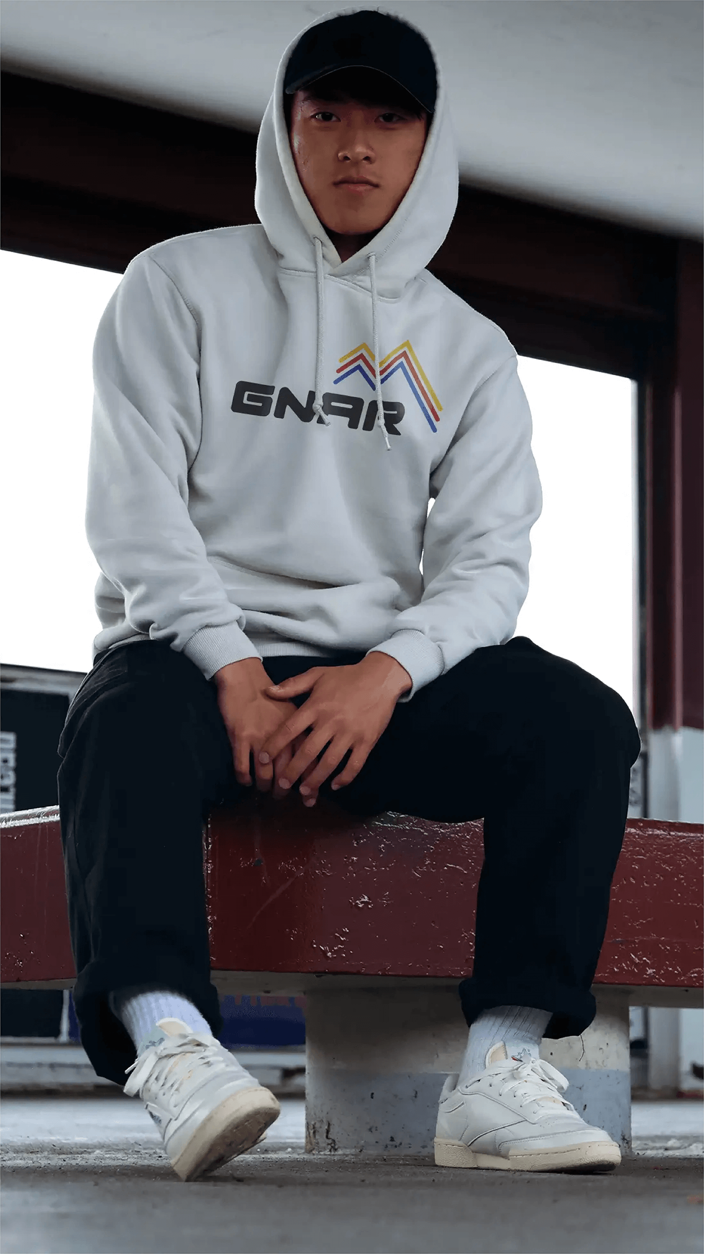
The task for this project was to create a snowboarding company and establish the brand. This included creating the wordmark, colours, themes, typography, and various apparel items such as shirts, hoodies, jackets, and helmet.
From the start I wanted to create a brand that catered itself more towards experienced snowboarders that shared great enthusiasm for the sport, seek out the highest mountains, and aim for the fastest speeds. As a result, the name GNAR (as in gnarly) was chosen. This name is derived from the saying, "shredding the gnar," which refers to a experienced rider performing well on the terrain.
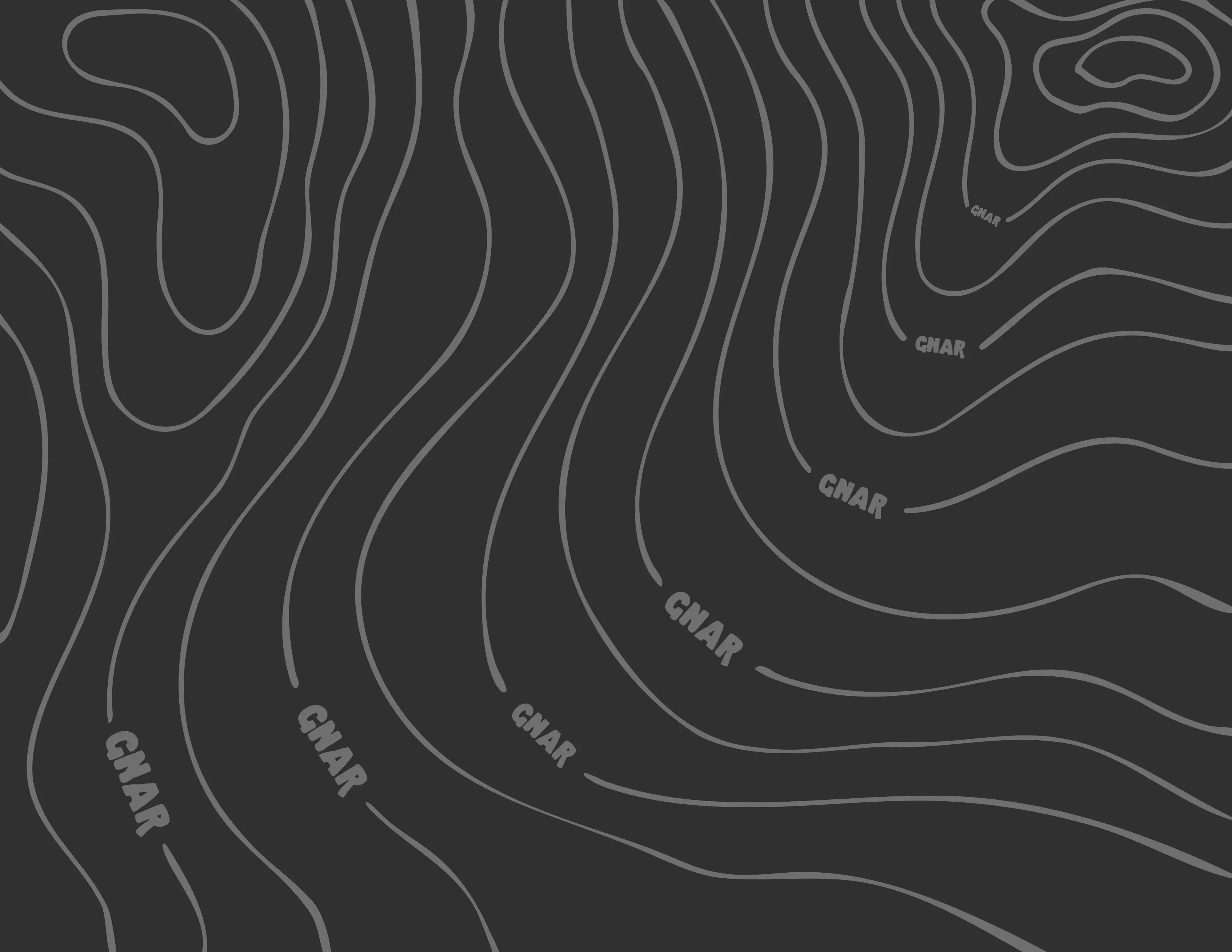
To further illustrate the ideals that represent the brand, the main motif--the contour lines found a topographical map--were chosen. Topographical maps are used to display the varying properties and elevation of mountainous regions, not unlike the regions that experienced snowboarders shred.
GNAR Wordmark
Main topographic illustration featuring "GNAR" where the elevation numbers would be.The three main themes of GNAR.
Tools used for this project.PS5 product demo motion graphic video.
The main goal of this project was to produce a one-minute product demonstration video for the Playstation 5, which was to be exclusively, with the acceptance of game footage, comprised of motion graphics created in Adobe After Effects. The video had to adhere to the guidelines outlined in the PS5 brand book, with the exception of game footage.
Storyboard of the PS5 product demo
The research required to develop a motion graphic video that aligned with the product was a crucial element of this project. To ensure that the video captured the essence of the PS5 commercials, I focused on incorporating timeless characteristics and the iconic Playstation Cross, Circle, Triangle, and Square symbols. My primary objective was to showcase the key features of the PS5 by utilizing these symbols to illustrate each function. In addition, I made an early decision to incorporate 3D elements into the motion graphic video to enhance its resemblance to a typical Playstation video.
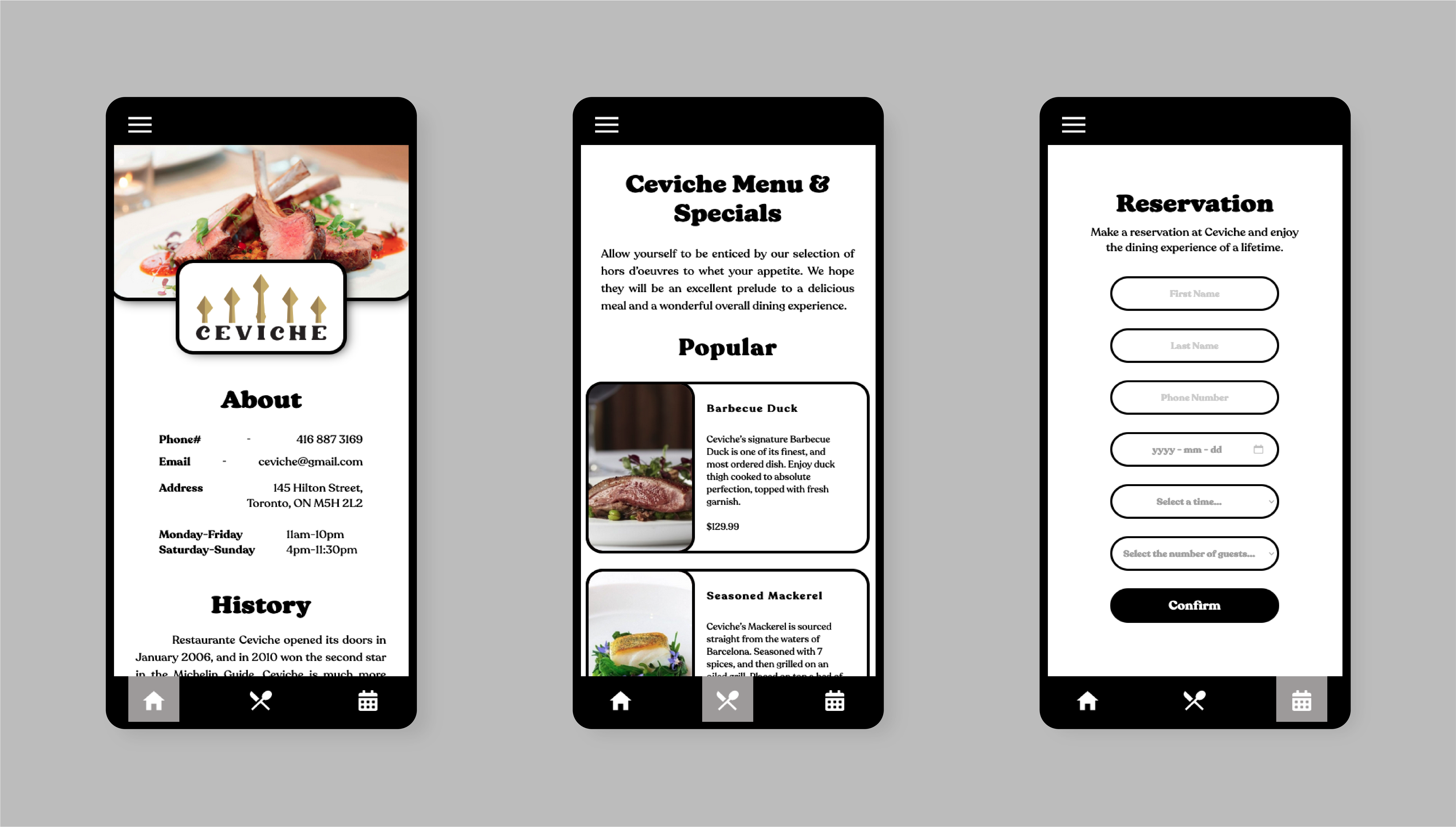
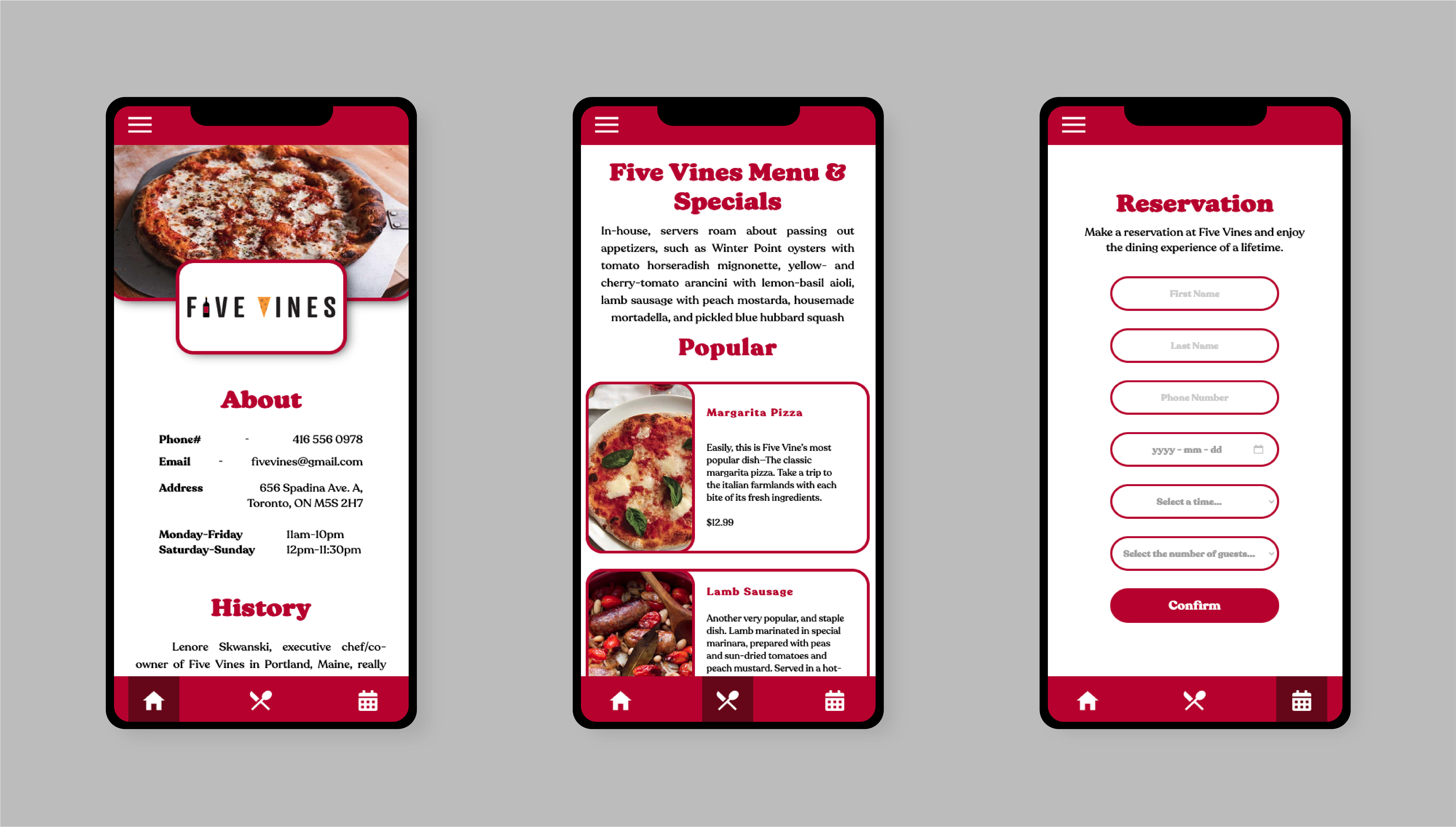
This project's main objective was to create the branding for the Family of Eateries company, in addition to creating its three restaurants: Cripsy's, Five Vines, and Ceviche. Once the design for the companies and restaurants were created, the next step was to design a mobile food-ordering app that housed pages for all three restaurants. This app would serve as a hub that would allow users to access menus from all three restaurants and place orders or reservations.
Each restaurant brings its own style and story, targeting three specific demographics allowing Family of Eateries to cater to wide variety of tastes and palates. Crispy's is your traditional fast-food dining experience specializing in their charbroiled burgers, while Five Vines is catered to those looking to experience the fine wines and cheeses of Italian cuisine in a sit-down restaurant. Lastly, there is Family of Eateries fine-dining option, Ceviche. This is a two-star Michelin restaurant that strives to deliver the taste of Barcelona in its highest-quality.
Family of Eateries restaurant logos.
My creative process of designing the Crispy's logo. From the start the main goal was always to have the words and letters stack on top of each other to imitate a burger. Crispy's prides itself on its long history, which also inspired the retro colour theme of the brand. If someone were to walk into a Crispy's I wanted the guest to know they were getting a fresh, authentic, and classic burger experience, evoking nostalgic feelings to a burger restaurant with their family when they were younger.
Hey! I'm Chris Peluso, an Interactive Media Designer from Ontario, Canada. I've always been fascinated with design and all things interactive - from cool video games to the vast world of the web. I graduated with a bachelor's degree from the University of Toronto, and now I'm honing my skills in the Interactive Media Design program at Durham College. Let's create some awesome and exciting interactive media together!